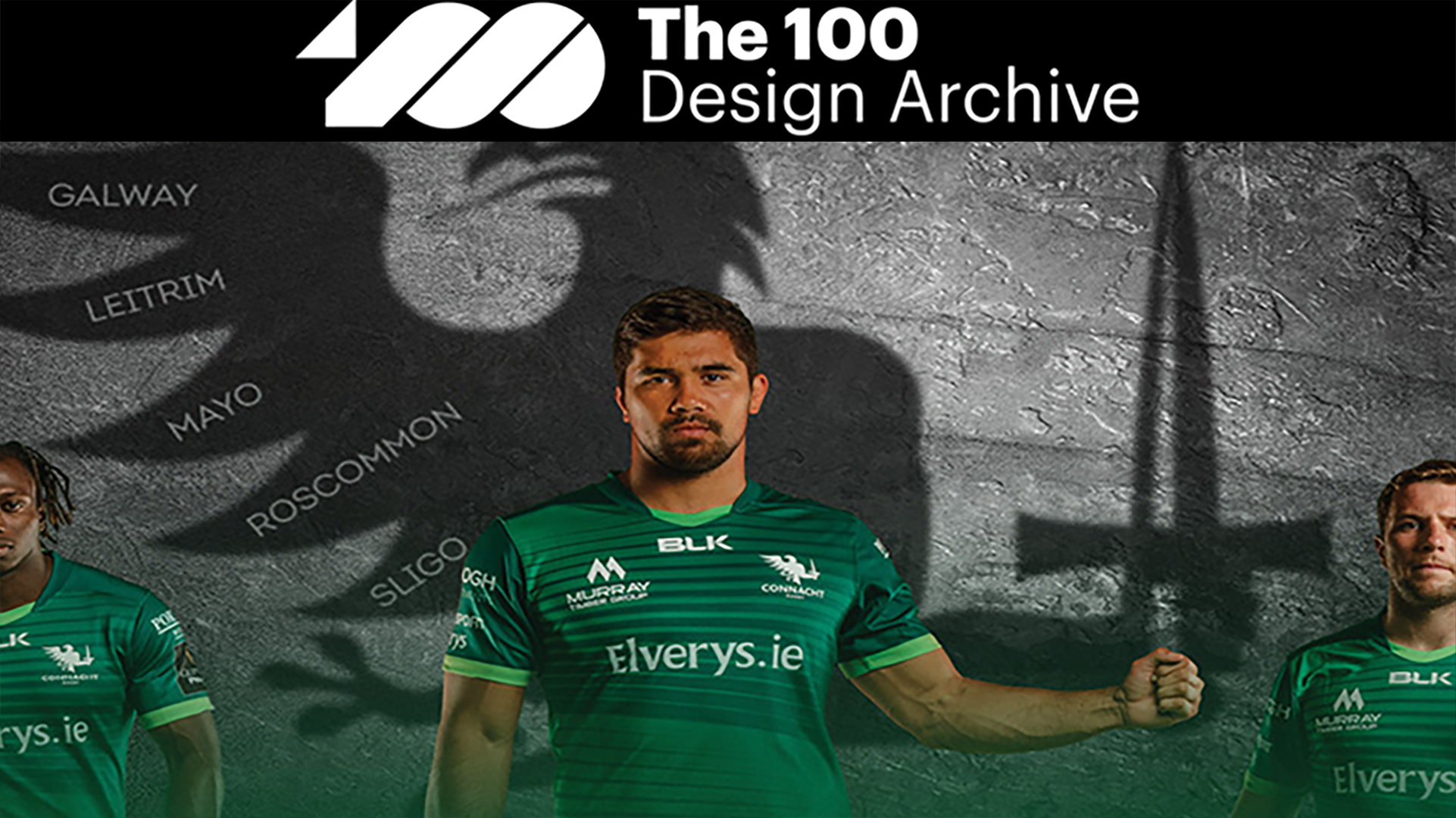
Connacht Rugby - Awarded to The 100 Design Archive
The challenge
Connacht Rugby was never seen as the hero in Irish Rugby lore, but this all changed when they won the Pro12 in 2016. From humble beginnings in 1885 to Pro12 Champions was a long time coming. This win inspired a new found confidence and heralded an exciting and vibrant future for the organisation and its supporters in the West of Ireland. This was also exemplified by the strategic vision for the club, ‘Grassroots to Green Shirts’, which set out a clear pathway for the future of the club.
When defining a purpose for Connacht Rugby, it was acknowledged that it really wasn’t about rugby at all. Rugby is a wonderful game but at the end of the day, it’s just a game. This was more about what the game of rugby, and sport in general, can do for the people and the place where you’re from. This is best summarised as “PRIDE in where we have come from, BELIEF in where we are headed and the AMBITION to succeed – this is The Connacht Way.” Our challenge was to develop a brand identity which supported the ambition of the club, reflecting the strong sense of place which grounds the club and the confidence in their ambition, while at the same time acknowledging the history and heritage built up over more than over 130 years.

The work
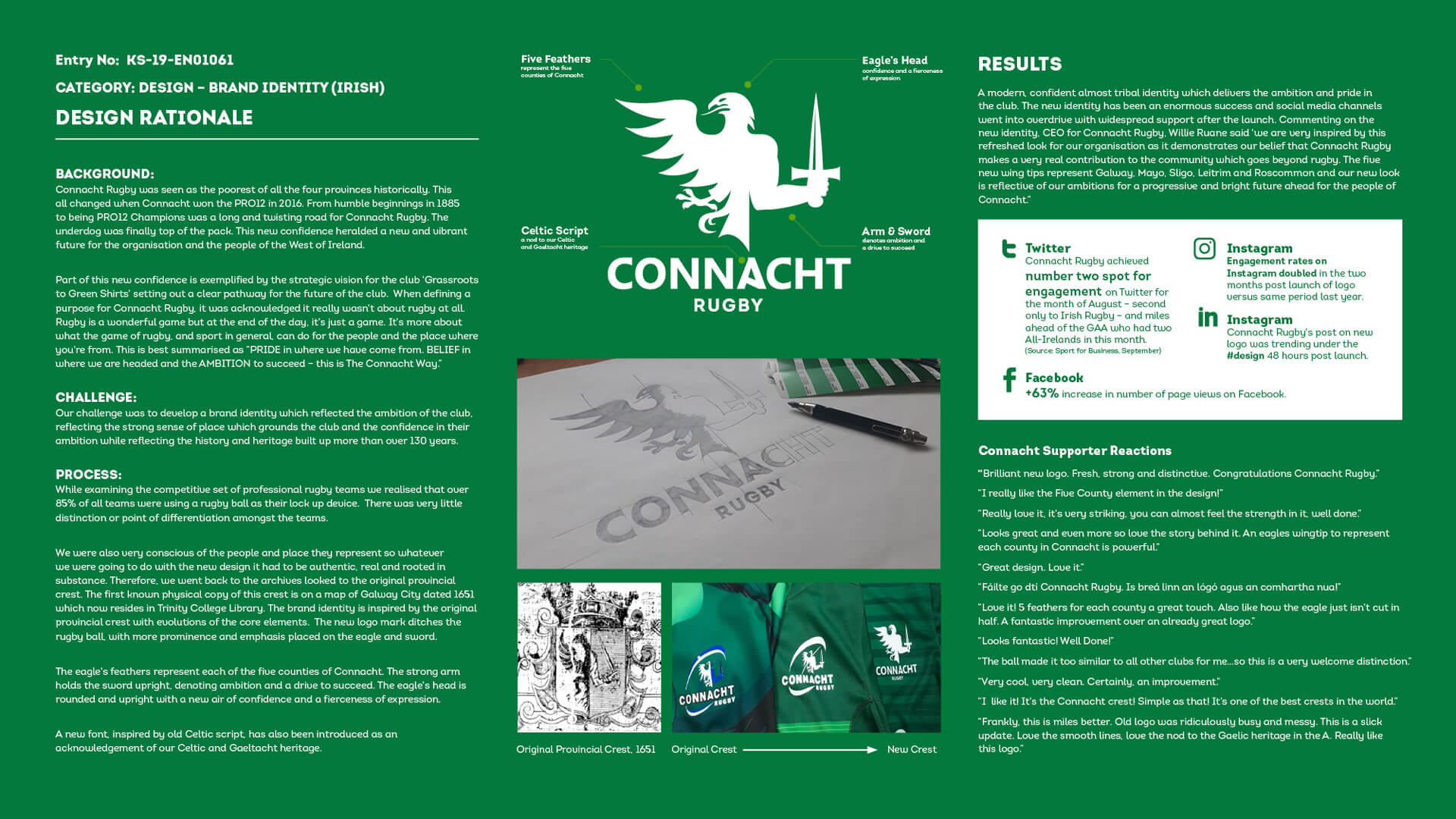
During our research phase we recognised that 85+% of all rugby brands were using a rugby ball as part of their core identity and logo. We also became conscious of the depth of emotional connection with both the people and the place that Connacht Rugby represents, so whatever we did with the new design had to be fully authentic, real and rooted in substance.
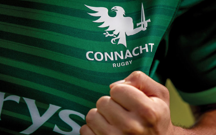
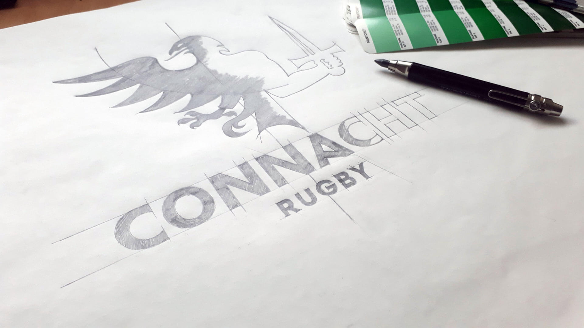
We took the original provincial crest from 1651 as our inspiration. The new logo mark emphasises the eagle and the sword from this crest; a powerful arm holds the sword upright, denoting strong ambition and a committed drive to succeed. The eagle’s head is rounded and upright with a strong air of confidence and a fierceness of expression. We also introduced a new font, inspired by old Celtic script, as an acknowledgement of the Celtic and Gaeltacht heritage.
The impact
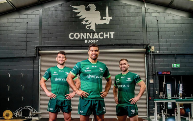
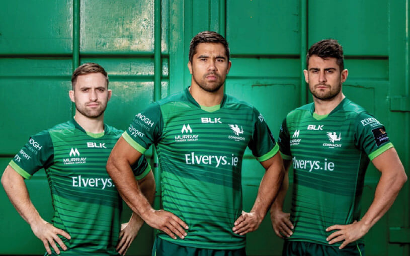
A modern, confident and almost tribal identity which reflects the strength of both the ambition and the pride associated with the club. The new identity has been an enormous success and social media channels went into overdrive with widespread support following launch. Pre-season jersey sales were up by 35% year-on-year.
The proof
"We are very inspired by this refreshed look for our organisation as it demonstrates our belief that Connacht Rugby makes a very real contribution to the community which goes beyond rugby."
- Willie Ruane, CEO Connacht Rugby.
Block D, Iveagh Court
Harcourt Street
Dublin 2, Ireland
info@designbankmbd.com
+353 (1) 660 4177
© 2024 Designbank, Marketing by Design. All rights reserved.
